Website tinting is a visual design technique that can transform how your audience perceives your brand in seconds.
Most websites struggle with visual hierarchy and user focus. Website tinting solves this by strategically layering colors, overlays, and transparency effects to guide visitors toward what matters most.
It's not about making things darker or lighter, it's about intentional visual control.
What is Website Tinting?
Website tinting refers to applying color overlays, transparency adjustments, and shade variations across web elements to enhance visual appeal and direct user attention. Think of it as adding a colored filter or semi-transparent layer over images, sections, or backgrounds.
Common applications include:
- Darkening background images while keeping text readable
- Adding colored overlays to hero sections for brand consistency
- Creating depth through layered transparency effects
- Highlighting call-to-action buttons with tinted backgrounds
- Establishing mood through subtle color shifts across page sections
Why Website Tinting Matters
Visual hierarchy is everything in web design. When done right, tinting helps visitors understand what to focus on without overthinking. It also strengthens brand identity by ensuring colors align with your messaging and values.
Tinting enhances your overall website structure by creating visual hierarchy that guides visitors toward key actions and conversion points.
From a conversion perspective, tinted overlays make text more legible over busy backgrounds, reduce cognitive load, and create a more polished, intentional appearance.
Early-stage startups especially benefit because tinting is cost-effective compared to custom photography or complex animations.
Examples and Types
1. Dark Tinting
Dark tinting is commonly used in hero sections to ensure text remains readable over dramatic background images while maintaining visual impact
2. Brand Color Tinting
Brand color tinting applies your primary or secondary colors as overlays to reinforce visual identity across multiple pages. This creates consistency without redesigning entire sections.
3. Gradient Tinting
Gradient tinting blends two or more colors for a modern, sophisticated look. It's particularly effective on landing pages and above-the-fold sections.
4. Accent Tinting
Accent tinting highlights specific elements like buttons or cards with subtle color shifts to draw attention without overwhelming the design.
How to Apply It
Start by identifying which elements need visual emphasis. Your hero section, call-to-action buttons, and key content blocks are prime candidates.
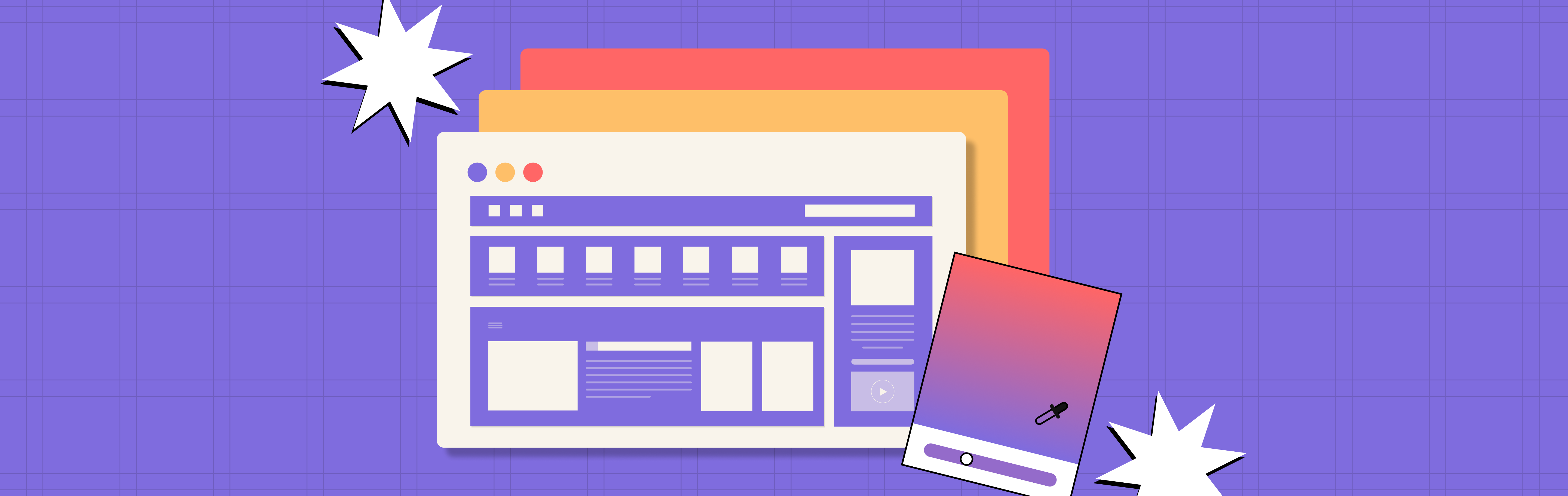
Use your design tool (Figma, Adobe XD, or even CSS) to add semi-transparent color layers. Keep opacity between 30 and 70 percent so the underlying element remains visible.
Test readability across devices and ensure text contrast meets accessibility standards.
For web implementation, use CSS overlays or background-color with opacity values. Keep file sizes light to avoid performance hits.
A/B testing different tint intensities helps you find the optimal balance between aesthetics and usability for your specific audience.
Key Takeaways
- Website tinting uses color overlays and transparency to guide user attention and strengthen visual hierarchy
- It improves text readability, brand consistency, and overall user experience without major redesigns
- Common types include dark tinting, brand color tinting, gradients, and accent tinting
- Implementation is straightforward through CSS or design tools with minimal performance impact
- Testing different opacity levels ensures you find the sweet spot between aesthetics and usability